Real Estate Price Prediction Algorithm across France
Project Details
- Category: Machine Learning
- Language: Python
- Client: CNRS and Inria
- Date: February 2023
- GitHub: Project Repository
The objective is to develop a Machine Learning model with the capability of accurately predicting the price of a house in France. This model will utilize a wide array of characteristic parameters that play a crucial role in determining the market value of a property. The code structure and dataset are inspired by a project by Prasanna Sattigeri. The features include the number of rooms, which speaks to the size and capacity of the house; the local crime rate, which greatly affects the desirability of a neighborhood; and the level of education, a statistic often indicative of the socioeconomic status of the surrounding area.
Introduction
The study will be done in several steps:
Step 1: Importing libraries and modules
# Import required libraries
import matplotlib.pyplot as plt
import numpy as np
import pandas as pd
import torch
import torch.nn as nn

from matplotlib.pyplot import plot, scatter, xlim, legend, title, figure
from torch.utils.data import Dataset, TensorDataset, DataLoader
from importlib import reload
from sklearn import datasets
from sklearn.model_selection import train_test_split
from sklearn.metrics import mean_squared_error

# Import UQ360 library for uncertainty quantification
from uq360.algorithms.homoscedastic_gaussian_process_regression import HomoscedasticGPRegression
from uq360.algorithms.ucc_recalibration import UCCRecalibration
from uq360.metrics import picp, mpiw, compute_regression_metrics, plot_uncertainty_distribution, plot_uncertainty_by_feature, plot_picp_by_feature
from uq360.metrics.uncertainty_characteristics_curve import UncertaintyCharacteristicsCurve as ucc
Step 2: Loading and pre-processing data
# Initialize parameters
nb_maisons = 1000
features = ['nb_pieces', 'taux_criminalite', 'taux_education']

# Generate synthetic data
nb_pieces = np.clip(np.ceil(10.0 * np.random.rand(nb_maisons)), 1, 10)
taux_criminalite = np.random.rand(nb_maisons)
taux_education = np.random.rand(nb_maisons)

# Define target variable as a function of input features
y = 0.5 * ( taux_education - taux_criminalite ) + 0.1 * ( nb_pieces + np.random.randn(nb_maisons))
y += 1.0
y = (250.0 / y.mean()) * y
X = np.hstack([nb_pieces.reshape(-1,1), taux_criminalite.reshape(-1,1), taux_education.reshape(-1,1)])
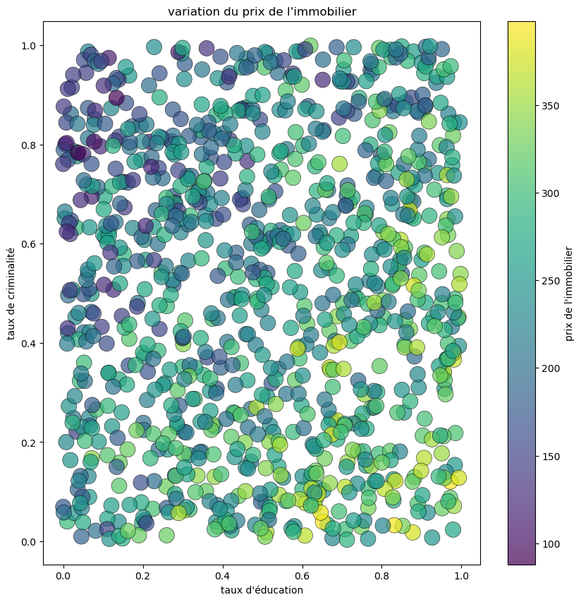
To verify that the generated data is consistent, we will now visualize on a graph the variation in property prices according to the crime rate and education level.
# Visualize the generated data
fig = plt.figure(figsize=(10, 10))
graphe = plt.scatter(taux_education, taux_criminalite, linewidths=0.5, alpha=0.7, edgecolor='black', s = 250, c=y)
plt.xlabel("Taux d'éducation")
plt.ylabel("Taux de criminalité dans le quartier")
plt.title("Visualisation des données")
graphe = plt.colorbar(graphe)
graphe.set_label("Prix de l'immobilier")
plt.show()
# Split the dataset into train and test subsets
x_train_full, x_test_full, y_train_full, y_test = train_test_split(X, y, test_size=0.4, random_state=0)
The test_size parameter is the proportion of the entire data set to include in the training set.
# Further split the training data for calibration
x_train_full, x_train_calib_full, y_train_full, y_train_calib = train_test_split(x_train_full, y_train_full, test_size=0.4, random_state=0)

# Filter out certain data points
x_train_full, y_train_full = x_train_full[x_train_full[:,0]>1], y_train_full[x_train_full[:,0]>1]
IMPORTANT: To understand how data influence the model's prediction, we will deliberately reduce the quality of the data set, as follows:
# Further split the training data
x_train_keep, x_train_discard, y_train_keep, y_train_discard = train_test_split(x_train_full, y_train_full, test_size=0.9, random_state=0)

# Concatenate the kept and selected discarded data
idxs = x_train_discard[:,0] < 6
x_train = np.concatenate([x_train_keep, x_train_discard[idxs]])
y_train = np.concatenate([y_train_keep, y_train_discard[idxs]])

# Apply a filter to the target variable
idxs = y_train < 300
x_train = x_train[idxs]
y_train = y_train[idxs]

# Select only two features
x_train_two_features = x_train[:,:2]
x_test_two_features = x_test_full[:,:2]
x_train_calib_two_features = x_train_calib_full[:,:2]
# Visualize the training data
fig = plt.figure(figsize=(10, 4))

plt.subplot(1, 2, 1)
plt.scatter(x_train[:,0], y_train, linewidths=0.5, alpha=0.7, edgecolor='black', s = 40)
plt.xlabel(features[0])
plt.ylabel('House pricing')
plt.title('Train data')

plt.subplot(1, 2, 2)
plt.scatter(x_train[:,1], y_train, linewidths=0.5, alpha=0.7, edgecolor='black', s = 40)
plt.xlabel(features[1])
plt.ylabel('House pricing')
plt.title('Train data')
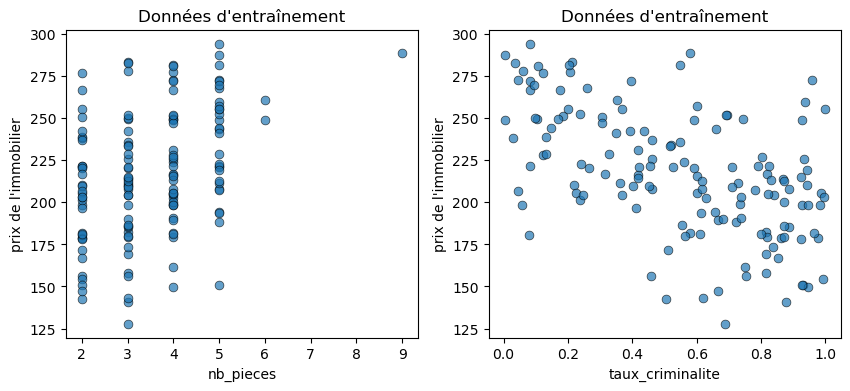
Here we clearly see that we used two types of variables:
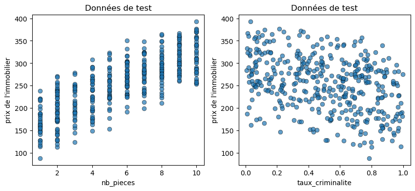
# Visualize the test data
fig = plt.figure(figsize=(10, 4))

plt.subplot(1, 2, 1)
plt.scatter(x_test_two_features[:,0], y_test, linewidths=0.5, alpha=0.7, edgecolor='black', s = 40)
plt.xlabel(features[0])
plt.ylabel('House pricing')
plt.title('Test data')

plt.subplot(1, 2, 2)
plt.scatter(x_test_two_features[:,1], y_test, linewidths=0.5, alpha=0.7, edgecolor='black', s = 40)
plt.xlabel(features[1])
plt.ylabel('House pricing')
plt.title('Test data')
Step 3: Training a Gaussian regression model
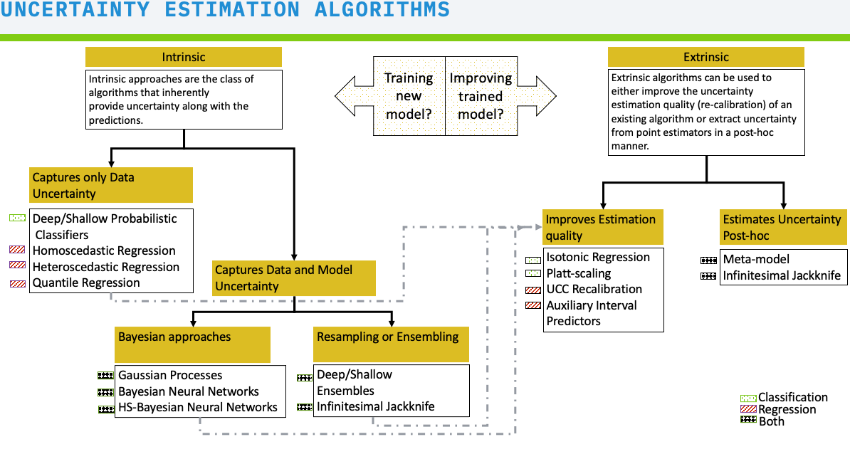
Based on the flowchart above, the most judicious choice is therefore to implement a Gaussian process to obtain predictions with 95% confidence intervals as well as information on uncertainties.
# Fit a Gaussian Process model to the data
gp = HomoscedasticGPRegression()
gp.fit(x_train_two_features, y_train.reshape(-1,1))
# Perform predictions with the model
y_test_mean, y_test_lower_total, y_test_upper_total, y_test_lower_epistemic, y_test_upper_epistemic, y_dists = gp.predict(x_test_two_features, return_epistemic=True, return_dists=True)
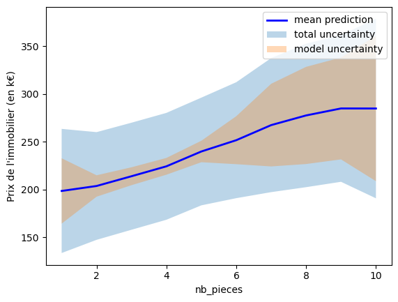
We now want to visualize the mean, prediction intervals, and uncertainties for the number of rooms.
# Plot uncertainty by features
plot_uncertainty_by_feature(x_test_two_features[:, 0], y_test_mean, y_test_lower_total, y_test_upper_total, y_test_lower_epistemic, y_test_upper_epistemic, xlabel=features[0], ylabel='Prix de l\'immobilier (en k€)');
Step 4: Evaluating Prediction Intervals
Prediction Interval Coverage Probability (PICP) is used to evaluate the calibration of the UQ method, we choose to use the PICP metric provided by UQ360. This is defined as the proportion of a sample (usually test data) covered by the prediction interval. In our case, we want PICP ~ 95% (or higher).
Mean Prediction Interval Width (MPIW) allows calculating the average width of prediction intervals (measured on test data).
IMPORTANT: When using re-calibration methods to improve PICP, MPIW can increase. To find the "operating point" of a model, you thus need to combine PICP and MPIW, which is what the Uncertainty Characteristic Curve (UCC) tool does, which we will use during the recalibration in step 5.
# Compute regression metrics
res = compute_regression_metrics(y_test, y_test_mean, y_test_lower_total, y_test_upper_total)
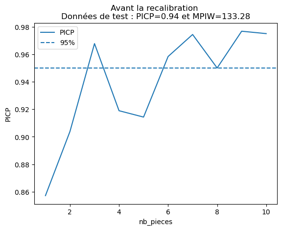
# Plot the Prediction Interval Coverage Probability (PICP) by feature before calibration for test data
plot_picp_by_feature(x_test_two_features[:, 0], y_test,
						y_test_lower_total, y_test_upper_total,
						xlabel=features[0],
						title="Before recalibration \nTest Data: PICP={:.2f} and MPIW={:.2f}".format(res["picp"], res["mpiw"]));
plot_picp_by_feature(x_test_two_features[:, 1], y_test,
y_test_lower_total, y_test_upper_total,
xlabel=features[1],
title="Before recalibration \nTest Data: PICP={:.2f} and MPIW={:.2f}".format(res["picp"], res["mpiw"]));
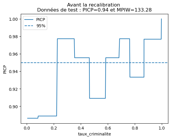
The displayed values are statistical information about the model's prediction:
# Print the PICP for houses with different numbers of rooms
for nb in np.unique(x_test_two_features[:,0]):
	coverage = picp(y_test[x_test_two_features[:,0]==nb],
				y_test_lower_total[x_test_two_features[:,0]==nb],
				y_test_upper_total[x_test_two_features[:,0]==nb])
	print("The PICP for houses with nb_pieces = {} is {}".format(nb, coverage))
Step 5: Recalibration via UCC (Uncertainty Charasteristic Curve)
To improve PICP values, we recalibrate the prediction intervals with the "Uncertainty Characteristic Curve" and re-evaluate the model.
# Fit the calibration model
gp_option_a = UCCRecalibration(base_model=gp)
gp_option_a = gp_option_a.fit(x_train_calib_two_features, y_train_calib)
calib_y_test_mean, calib_y_test_lower_total, calib_y_test_upper_total = gp_option_a.predict(x_test_two_features, missrate=0.05)
# Compute regression metrics after calibration
res_calibrated = compute_regression_metrics(y_test, calib_y_test_mean, calib_y_test_lower_total, calib_y_test_upper_total)
# Print the calibrated PICP for houses with different numbers of rooms
for nb in np.unique(x_test_two_features[:,0]):
	coverage = picp(y_test[x_test_two_features[:,0]==nb],
				calib_y_test_lower_total[x_test_two_features[:,0]==nb],
				calib_y_test_upper_total[x_test_two_features[:,0]==nb])
	print("The calibrated PICP for houses with nb_pieces = {} is {}".format(nb, coverage))
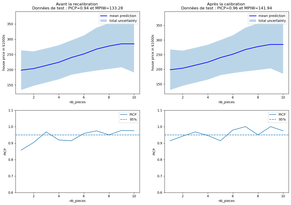
# Plot the uncertainty by feature and PICP by feature before and after calibration
fig, axs = plt.subplots(2, 2,figsize=(15,10))

plot_uncertainty_by_feature(x_test_two_features[:, 0], y_test_mean,
							y_test_lower_total, y_test_upper_total,
							xlabel=features[0], ylabel='house price in $1000s',
							ax=axs[0,0],
							title="Before recalibration \nTest Data: PICP={:.2f} and MPIW={:.2f}".format(
							res["picp"], res["mpiw"]));

plot_uncertainty_by_feature(x_test_two_features[:, 0], y_test_mean,
							calib_y_test_lower_total, calib_y_test_upper_total,
							xlabel=features[0], ylabel='house price in $1000s',
							ax=axs[0,1],
							title="After calibration \nTest Data: PICP={:.2f} and MPIW={:.2f}".format(
							res_calibrated["picp"], res_calibrated["mpiw"]));

plot_picp_by_feature(x_test_two_features[:, 0], y_test,
						y_test_lower_total, y_test_upper_total,
						xlabel=features[0],
						title="",
						ax=axs[1,0],
						ylims=[0.6,1.1]);

plot_picp_by_feature(x_test_two_features[:, 0], y_test,
						calib_y_test_lower_total, calib_y_test_upper_total,
						xlabel=features[0],
						title="",
						ax=axs[1,1],
						ylims=[0.6,1.1]);
# Create a subplot of 1 row and 2 columns with a specified figure size
fig, axs = plt.subplots(1, 2, figsize=(15, 5))

# Plot the Prediction Interval Coverage Probability (PICP) before recalibration for test data,
# y_test_lower_total and y_test_upper_total are the lower and upper prediction intervals respectively
plot_picp_by_feature(x_test_two_features[:, 1], y_test,
						y_test_lower_total, y_test_upper_total,
						xlabel=features[1],
						ax=axs[0],
						title="Before recalibration \nTest data: PICP={:.2f} and MPIW={:.2f}".format(res["picp"], res["mpiw"]),
						ylims=[0.6,1.1])

# Plot the PICP after recalibration for test data
plot_picp_by_feature(x_test_two_features[:, 1], y_test,
						calib_y_test_lower_total, calib_y_test_upper_total,
						xlabel=features[1],
						ax=axs[1],
						title="After recalibration \nTest data: PICP={:.2f} and MPIW={:.2f}".format(res["picp"], res["mpiw"]),
						ylims=[0.6,1.1])
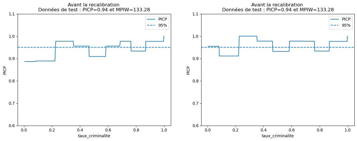
We clearly observe that the PICP has increased thanks to the recalibration, particularly for houses with more than 5 rooms. However, be aware that improving calibration does not reduce uncertainty. It's often the opposite because the MPIW metric is likely to increase in such situations.
Step 6: Adding a Parameter to Reduce Aleatoric Uncertainty
To improve the model's performance, we can seek to reduce uncertainties. Random uncertainty is related to the data, so adding features to these data will increase the reliability of the model's predictions by reducing the width of the confidence intervals (i.e., MPIW).
We will first seek to visualize the predictive uncertainty of the model, with Gaussian UQ methods. In particular, we want to distinguish random uncertainty and epistemic uncertainty. Indeed, they are different and are not reduced in the same way.
The random uncertainty of our model is due to the fact that it doesn't always understand why two houses with the same number of rooms can have a price that varies a lot. This variation can be explained by the crime rate, but sometimes that's not enough and other parameters must be added to the model (i.e., other features to the houses).
In our case, we mentioned earlier the education level, and we are going to implement it in our model, which until now, was content with the first two parameters (number of rooms and crime rate).
# Assign x_train to x_train_three_features and x_test_full to x_test_three_features
x_train_three_features = x_train
x_test_three_features = x_test_full
# Initialize the homoscedastic GP regression model
gp_expanded = HomoscedasticGPRegression()

# Fit the model on the training data
gp_expanded.fit(x_train_three_features, y_train.reshape(-1, 1))
# Predict the test set results and compute uncertainty measures
y_test_mean_expanded, y_test_lower_total_expanded, y_test_upper_total_expanded, y_test_lower_epistemic_expanded, y_test_upper_epistemic_expanded, y_epistemic_dists_expanded = gp_expanded.predict(x_test_three_features, return_epistemic=True, return_epistemic_dists=True)
# Compute the regression metrics for the test set
res_expanded = compute_regression_metrics(y_test, y_test_mean_expanded, y_test_lower_total_expanded, y_test_upper_total_expanded)
# Create a subplot of 2 rows and 2 columns with a specified figure size
fig, axs = plt.subplots(2, 2, figsize=(15,10))

# Plot the uncertainties before and after adding the education rate feature
plot_uncertainty_by_feature(x_test_two_features[:, 0], y_test_mean,
							y_test_lower_total, y_test_upper_total,
							y_test_lower_epistemic, y_test_upper_epistemic,
							xlabel=features[0], ylabel='house price in $1000s',
							ax=axs[0,0],
							title="Before adding education rate \nTest data: PICP={:.2f} and MPIW={:.2f}".format(res["picp"], res["mpiw"]))

plot_uncertainty_by_feature(x_test_three_features[:, 0], y_test_mean_expanded,
							y_test_lower_total_expanded, y_test_upper_total_expanded,
							y_test_lower_epistemic_expanded, y_test_upper_epistemic_expanded,
							xlabel=features[0], ylabel='house price in $1000s',
							ax=axs[0,1],
							title="After adding education rate \nTest data: PICP={:.2f} and MPIW={:.2f}".format(res_expanded["picp"], res_expanded["mpiw"]))

# Plotting PICP (Prediction Interval Coverage Probability) by feature for two features test data
plot_picp_by_feature(x_test_two_features[:, 0], y_test,
						y_test_lower_total, y_test_upper_total,
						xlabel=features[0],
						ax=axs[1,0],
						ylims=[0.6,1.1],
						title="Données de test : PICP={:.2f} et MPIW={:.2f}"\
						.format(res["picp"], res["mpiw"]));

# Plotting PICP by feature for three features test data (expanded)
plot_picp_by_feature(x_test_three_features[:, 0], y_test,
						y_test_lower_total_expanded, y_test_upper_total_expanded,
						xlabel=features[0],
						ax=axs[1,1],
						ylims=[0.6,1.1],
						title="Données de test : PICP={:.2f} et MPIW={:.2f}"\
						.format(res_expanded["picp"], res_expanded["mpiw"]));
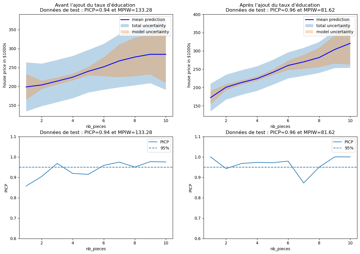
We clearly see better results after adding the education level, especially concerning random uncertainty.
# Repeat the process for each feature in three features test data
plot_picp_by_feature(x_test_three_features[:, 1], y_test,
						y_test_lower_total_expanded, y_test_upper_total_expanded,
						xlabel=features[1],
						title="Données de test : PICP={:.2f} et MPIW={:.2f}"\
						.format(res_expanded["picp"], res_expanded["mpiw"]));
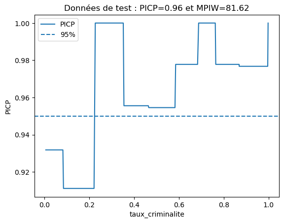
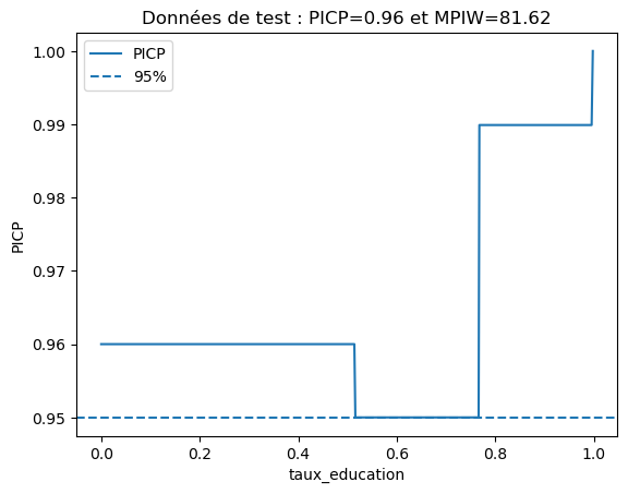
plot_picp_by_feature(x_test_three_features[:, 2], y_test,
					y_test_lower_total_expanded, y_test_upper_total_expanded,
					num_bins=5,
					xlabel=features[2],
					title="Données de test : PICP={:.2f} et MPIW={:.2f}"\
					.format(res_expanded["picp"], res_expanded["mpiw"]));
# Calculate and print the PICP coverage for each unique value in the first feature of the three features test data
for nb in np.unique(x_test_three_features[:,0]):
	coverage = picp(y_test[x_test_three_features[:,0]==nb],
				y_test_lower_total_expanded[x_test_three_features[:,0]==nb],
				y_test_upper_total_expanded[x_test_three_features[:,0]==nb])
	print("Le PICP pour des maisons avec nb_pieces = {} est {}".format(nb, coverage))
Thus, adding the education_rate feature helped reduce MPIW.
Step 7: Data Augmentation to Reduce Epistemic Uncertainty
Epistemic uncertainty (i.e., related to the model) can be reduced by increasing the data used to train the model. This will allow diversifying the training set and thus will improve the model's likelihood.
In our case, we deliberately influenced the diversification of data by reducing the number of houses with more than 5 rooms and those whose price is higher than 300 k€. This modification was observed when we visualized the model evaluation metrics so we can solve this kind of problem even when we didn't deliberately influence the data set.
This time, we will therefore use all the data generated during the second step of our project.
# Assigning the full train and calibration data to new variables
x_train_new, x_train_calib_new, y_train_new, y_train_calib_new = x_train_full, x_train_calib_full, y_train_full, y_train_calib
# Plotting training data
fig = plt.figure(figsize=(10, 5))

plt.subplot(1, 2, 1)
plt.scatter(x_train_new[:,0], y_train_new, linewidths=0.5, alpha=0.7, edgecolor='black', s = 40)
plt.xlabel(features[0])
plt.ylabel('Prix de l\'immobilier')
plt.title('Données d\'entraînement')

plt.subplot(1, 2, 2)
plt.scatter(x_train_new[:,1], y_train_new, linewidths=0.5, alpha=0.7, edgecolor='black', s = 40)
plt.xlabel(features[1])
plt.ylabel('Prix de l\'immobilier')
plt.title('Données d\'entraînement')
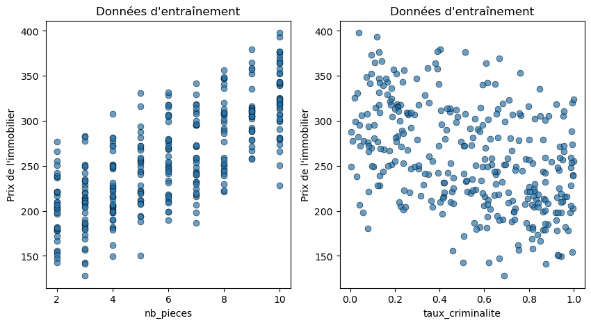
We clearly see that the data are distributed more "homogeneously" without any cases being left out.
# Fitting Homoscedastic Gaussian Process Regression model
gp_new = HomoscedasticGPRegression()
gp_new.fit(x_train_new, y_train_new.reshape(-1,1))
# Predicting test data using the model and also retrieving epistemic uncertainty information
sortie_modele = gp_new.predict(x_test_three_features, return_epistemic=True, return_epistemic_dists=True)

y_test_mean_new = sortie_modele.y_mean
y_test_lower_total_new = sortie_modele.y_lower
y_test_upper_total_new = sortie_modele.y_upper
y_test_lower_epistemic_new = sortie_modele.y_lower_epistemic
y_test_upper_epistemic_new = sortie_modele.y_upper_epistemic
y_epistemic_dists_new = sortie_modele.y_epistemic_dists
res_full = compute_regression_metrics(y_test, y_test_mean_new, y_test_lower_total_new, y_test_upper_total_new)
# Calculate and print the PICP coverage for each unique value in the first feature of the three features test data after fitting new model
for nb in np.unique(x_test_three_features[:,0]):
	coverage = picp(y_test[x_test_three_features[:,0]==nb],
				y_test_lower_total_new[x_test_three_features[:,0]==nb],
				y_test_upper_total_new[x_test_three_features[:,0]==nb])
	print("Le PICP pour des maisons avec nb_pieces = {} est {}".format(nb, coverage))
# Plotting uncertainty by feature for three features test data before and after adding training data
fig, axs = plt.subplots(2, 2,figsize=(15,10))

plot_uncertainty_by_feature(x_test_three_features[:, 0], y_test_mean_expanded,
							y_test_lower_total_expanded, y_test_upper_total_expanded,
							y_test_lower_epistemic_expanded, y_test_upper_epistemic_expanded,
							xlabel=features[0], ylabel='Prix de l\'immobilier (en k€)',
							ax=axs[0,0],
							title="Avant l'ajout de données d\'entraînement \nDonnées de test : PICP={:.2f} et MPIW={:.2f}"\
							.format(res_expanded["picp"], res_expanded["mpiw"]));

plot_uncertainty_by_feature(x_test_three_features[:, 0], y_test_mean_new,
							y_test_lower_total_new, y_test_upper_total_new,
							y_test_lower_epistemic_new, y_test_upper_epistemic_new,
							xlabel=features[0], ylabel='Prix de l\'immobilier (en k€)',
							ax=axs[0,1],
							title="Après l'ajout de données d\'entraînement \nDonnées de test : PICP={:.2f} et MPIW={:.2f}"\
							.format(res_expanded["picp"], res_expanded["mpiw"]));

# Plotting PICP by feature for three features test data before and after adding training data
plot_picp_by_feature(x_test_three_features[:, 0], y_test,
						y_test_lower_total_expanded, y_test_upper_total_expanded,
						xlabel=features[0],
						ax=axs[1,0],
						ylims=[0.6,1.1],
						title="Données de test : PICP={:.2f} et MPIW={:.2f}"\
						.format(res_expanded["picp"], res_expanded["mpiw"]));
We visualize several things:
# Re-plotting the PICP for the first feature of three-features test data, but now with the new prediction results
plot_picp_by_feature(x_test_three_features[:, 0], y_test,
						y_test_lower_total_new, y_test_upper_total_new,
						xlabel=features[0],
						ax=axs[1,1],
						ylims=[0.6,1.1],
						title="Données de test : PICP={:.2f} et MPIW={:.2f}"\
						.format(res_expanded["picp"], res_expanded["mpiw"]));
Step 8: Interpreting and Accounting for Uncertainties
Prices are predicted with a 95% confidence interval. There are many methods to account for uncertainties:
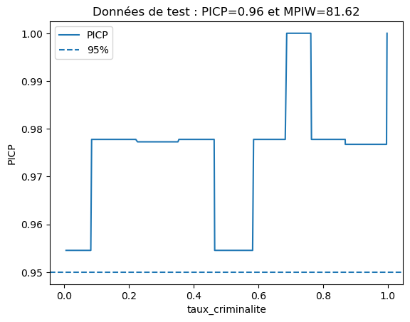
# Re-plotting the PICP for the second feature of two-features test data, but now with the new prediction results
plot_picp_by_feature(x_test_two_features[:, 1], y_test,
						y_test_lower_total_new, y_test_upper_total_new,
						xlabel=features[1],
						title="Test data: PICP={:.2f} and MPIW={:.2f}"\
						.format(res_expanded["picp"], res_expanded["mpiw"]));

# Sorting the expanded and new epistemic distributions based on their standard deviation
sorted_expanded = np.argsort([dist.std() for dist in y_epistemic_dists_expanded])
sorted_new = np.argsort([dist.std() for dist in y_epistemic_dists_new])

# Initialize a subplot grid
fig, axs = plt.subplots(2, 2,figsize=(15,10))

# Plotting uncertainty distribution of the most certain prediction before and after adding training data
plot_uncertainty_distribution(y_epistemic_dists_expanded[sorted_expanded[0]], show_quantile_dots=True,
								qd_sample=20, qd_bins=7, ax=axs[0,0],
								xlabel = "Real estate price (in k€)",
								ylabel = "Probability density",
								title="Before: Most certain (with a standard deviation of {:.2f} k€)"\
								.format(y_epistemic_dists_expanded[sorted_expanded[0]].std()));

plot_uncertainty_distribution(y_epistemic_dists_new[sorted_new[0]], show_quantile_dots=True,
								qd_sample=20, qd_bins=7, ax=axs[0,1],
								xlabel = "Real estate price (in k€)",
								ylabel = "Probability density",
								title="After: Most certain (with a standard deviation of {:.2f} k€)"\
								.format(y_epistemic_dists_new[sorted_new[0]].std()));

# Plotting uncertainty distribution of the most uncertain prediction before and after adding training data
plot_uncertainty_distribution(y_epistemic_dists_expanded[sorted_expanded[-1]], show_quantile_dots=True,
								qd_sample=20, qd_bins=7, ax=axs[1,0],
								xlabel = "Real estate price (in k€)",
								ylabel = "Probability density",
								title="Before: Most uncertain (with a standard deviation of {:.2f} k€)"\
								.format(y_epistemic_dists_expanded[sorted_expanded[-1]].std()));

plot_uncertainty_distribution(y_epistemic_dists_new[sorted_new[-1]], show_quantile_dots=True,
								qd_sample=20, qd_bins=7, ax=axs[1,1],
								xlabel = "Real estate price (in k€)",
								ylabel = "Probability density",
								title="After: Most uncertain (with a standard deviation of {:.2f} k€)"\
								.format(y_epistemic_dists_new[sorted_new[-1]].std()));
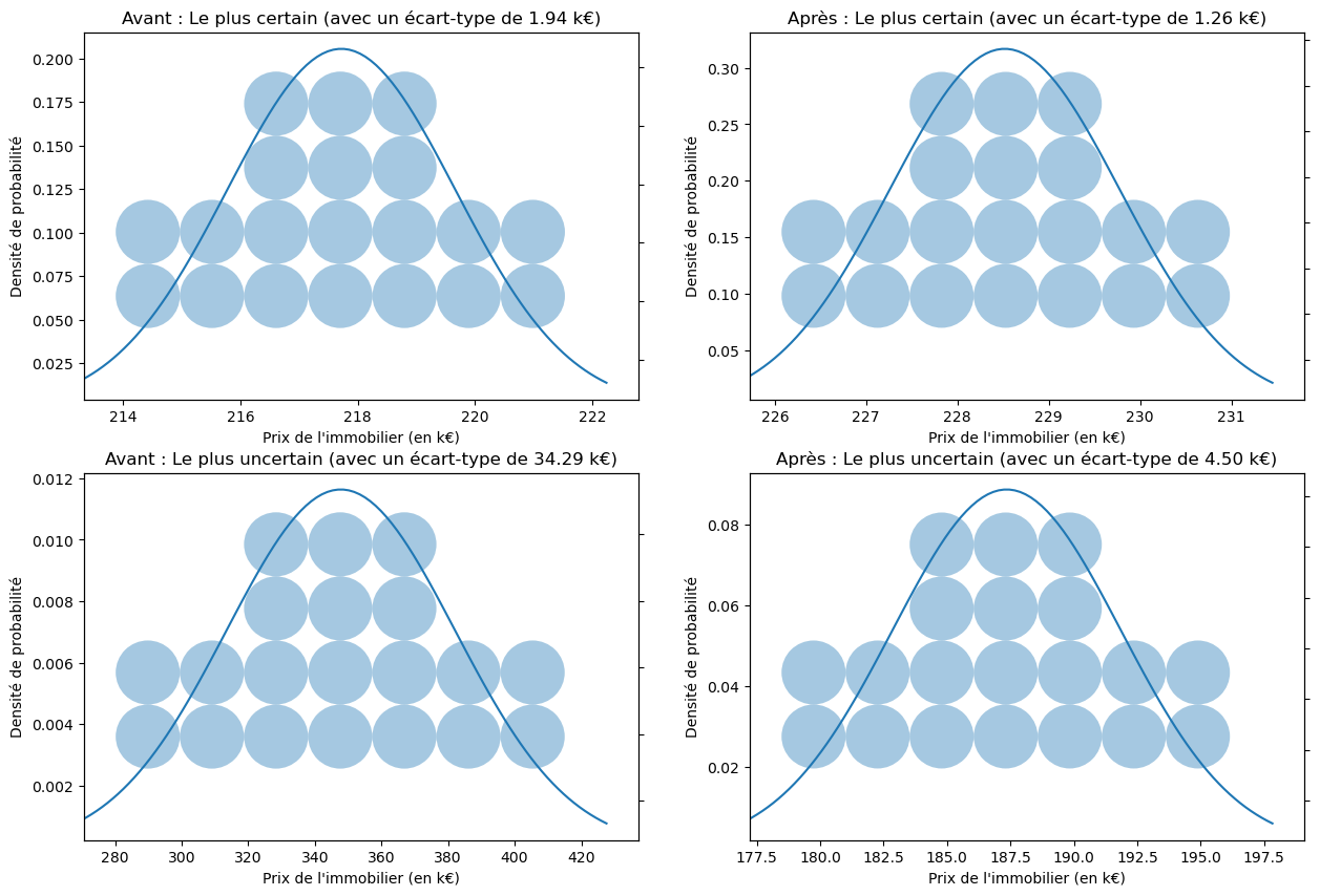
We see that recalibration and the reduction of random and epistemic uncertainties help reduce the standard deviations of our predictions.
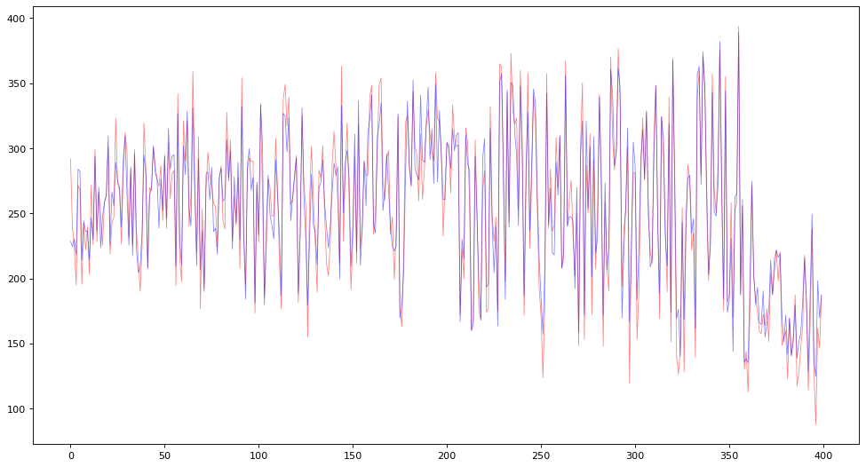
# Creating a new figure
figure(figsize=(15,8), dpi=80)

# Initializing lists to store true prices, predicted prices, and indices
Y_prix_vrais = []
Y_prix_preds = []
X_index = []

# Initializing variables to calculate average true price and average predicted price
moyenne_vraie = 0
moyenne_preds = 0

# For the first 400 predictions, store true prices, predicted prices, and calculate averages
for i in range(400):
	X_index.append(i)
	Y_prix_vrais.append(y_test[sorted_new[i]])
	Y_prix_preds.append(y_test_mean_new[sorted_new[i]])
	moyenne_vraie += y_test[sorted_new[i]]
	moyenne_preds += y_test_mean_new[sorted_new[i]]

# Printing average true price and average predicted price
print("Average of true prices = ", moyenne_vraie/400)
print("Average of predicted prices = ", moyenne_preds/400)

# Plotting true prices and predicted prices
plt.plot(X_index,Y_prix_vrais,color='red',alpha=0.5,linewidth=0.7)
plt.plot(X_index,Y_prix_preds,color='blue',alpha=0.5,linewidth=0.7)
plt.show()

# Printing the true price, predicted price, and the prediction uncertainty for the first 10 predictions
print("For 10 houses:\n")
for i in range(10):
		print("True price: {:.2f} k€, Prediction: {:.2f} +/- {:.2f} k€, number of rooms: {:.2f}, crime rate: {:.2f}, education rate: {:.2f}"          .format(y_test[sorted_new[i]], y_test_mean_new[sorted_new[i]], 2.0 *y_epistemic_dists_new[sorted_new[i]].std(),                  x_test_full[sorted_new[i],0], x_test_full[sorted_new[i],1], x_test_full[sorted_new[i],2]))